oom pasikom is wearing colors

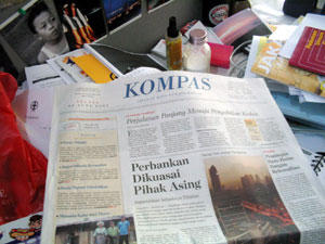
"Kompas" is Indonesia's "The Washington Post", "The Globe and Mail", "Die Zeit", "Le Monde", "The Sunday Times". It is the biggest newspaper. Today, June 28, 2005, after 40 years of nine columns in a page and black and white logotype, they did a complete redesign of the whole thing.
Royal blue logotype, seven columns in a page, every news section logo type is printed in two colors: bright red for the first letter and royal blue for the rest. Then they dedicate one full page of explanation about the new design. They even gave a special box on "Kompas Architecture" and something similar on FAQ about the change, including a subject on circulation price. The whole 40 pages looks like "Pantone Color Chart" to me. Even "Oom Pasikom"** is wearing color clothes today *winks*
"Kompas redesigned" has bigger fonts and wider spacing. Does it mean that contents are reduced? Does it mean that news quality is decreasing? Does quality is sacrificed over quantity and looks? Only time can tell..
If you read your paper from front to back, you will get a pretty good idea of what "Kompas" is turning into after 40 years of time. If you read your paper from back to front the way I am, you will also get a pretty good idea of how "Kompas" is changing. Arbain Rambey's photograph titled "When the sun rises" caught your sight on the first page of "Kompas redesigned", followed by Daniel Dhakidae's and Ninok Leksono's articles in "Opini" (opinion, a section within the paper). Jakob Oetama's main article is literally on top of everything. But, is Kompas trying to be humble (or secretive or even better: to save space?) by not mentioning all of their newsroom staff members in the "masthead box" that usually occupies page four?
Yes, it's smaller
Yes, it has more color
Yes, space is wider
Yes, it's a lot cooler *winks*
============================
** for non Indonesian and non "Kompas" readers, "Oom Pasikom" is a cartoon that appears every day in the paper. Usually, it either carefully criticize or launch plain vanilla, harmless comments on Indonesia's current affairs.
Photos courtesy of: Myself.
Labels: media
2 Comments:
saya ngacung, mbah. RD: saya jatuh cinta dengan judul: "oom pasikom is wearing colors"
Wed Jun 29, 11:35:00 PM 2005
Hello Adrita,
In Malaysia, we have Berita Harian and New Straits Times among the main newspapers and they too had recently changed their looks. More colours and catchy looking front page.
For me change in any forms is good in order to progress.
Thu Jun 30, 08:41:00 AM 2005
Post a Comment
<< Home